
Outlawyer:
Short Case Study
Note: this case study is posted just to showcase my design process. This is not official work as I'm not the UI/UX Designer of Outlawyer.
UX/UI Designer:
Faraz
Tasks:
• UX/UI Analysis
• UI Mockups
Project Overview

Product
Outlawyer
Length
~A couple days
Problem
How can we improve on the Outlawyer UX/UI?
Goal
Design some UI from scratch that improves usability of players and fits the game's theme
UX/UI Analysis
Playing the Demo
I played the demo because I was asked how I could improve the UX/UI of the current build of the game. Below are current screenshots of the demo of the game "Outlawyer"
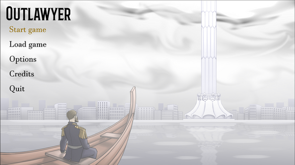
The menu is simple and gets the job done. It's easy to distinguish what's being hovered. We can improve it by adding a little bit more personality that fits the game's theme

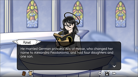
The text is clear and easy to read. The icons are very well done. They follow a principle called "form follows function" which means their visual hints to their functionality. However, the hovering effect could introduce a little more contrast. I noticed that providing more emphasis to "objection" could improve the look

This is the screen where you try to defend against the allegation that was made against your client.
-
I noticed there is no UI feedback on the bottom buttons
-
I had a hard time understanding the number on the rightmost icon
-
Providing a bit more context on what the player is defending against (users forget quickly and reminders are always nice)

Saving functionality works, but the UI seems to be a work in progress still. One of my favorite ideas was to use the book of deeds as the background for saving. I thought it would be very thematically accurate
UI Mockups
Designs
When I provided the UX suggestions, I provided some mockups to the screens and brought my ideas to life. Here are the mockups


Improvements

BEFORE

AFTER
-
Replaced the game title with the game logo showcased on their kickstarter
-
Moved the menu options to be focused on the center
-
Added more pizzazz to the main menu, by adding a hover effect and border that fits the purgatory theme

BEFORE

AFTER
-
Made "OBJECTION" a lot bigger with exclamation marks, adding more hype and emphasis to the screen

BEFORE
AFTER
-
I changed the name font to something else to provide some personality to the names. I avoided using that font for the dialogue so it's easily readable
-
The icons were already great so I replicated them in my own style

BEFORE

AFTER
-
The dialogue box in the bottom took too much space for the question and that caused the answers to go above the characters causing too much clutter so I made the dialogue box a lot smaller and moved it above the characters
-
The answers provide a speech box directing to the person that is talking so it's easy to tell who's talking with the name badge above their character too
Next Steps
-
Tweak the existing designs based on developer suggestions
-
Develop wireframes to come up with a saving system that works well and looks great
-
Revisit the UI on the other screens I mentioned above to work the usability
-
Test with players to get real time feedback
I wasn't the official UI/UX designer of this project, but I got valuable experience of working on a game UI from scratch and I very much appreciate that. Special thanks to the developer, Jim Milton, for allowing me to post this!
