
Animal Crossing:
Case Study
UX/UI Designer:
Faraz
Tasks:
• Player Journey
• Paper Prototyping/Flow Charts
• Wireframing
• UI Mockups
• Accessibility
Project Overview
_edited.jpg)
Product
Animal Crossing
Length
~Approximately a week
Problem
How can we improve on the Animal Crossing UX/UI?
Goal
Recreate the animal crossing UX/UI and implement improvements
Work Process
Player Journey
Paper Prototype
Flow Chart
Wireframe
Design
Usability Test
UI Mockups
Accessi-bility
Understanding the Player
Player Journey
![[Faraz Forghani]. UX_UI for Gaming. Class 1-13 (25).png](https://static.wixstatic.com/media/730f7d_b75ccdefb6584e3bbcebed5e3da63503~mv2.png/v1/fill/w_447,h_447,al_c,q_85,usm_0.66_1.00_0.01,enc_avif,quality_auto/730f7d_b75ccdefb6584e3bbcebed5e3da63503~mv2.png)
![[Faraz Forghani]. UX_UI for Gaming. Class 1-13 (27).png](https://static.wixstatic.com/media/730f7d_8ada2d4b6ac0440a99588cfdf81aa790~mv2.png/v1/fill/w_510,h_510,al_c,q_85,usm_0.66_1.00_0.01,enc_avif,quality_auto/730f7d_8ada2d4b6ac0440a99588cfdf81aa790~mv2.png)

![[Faraz Forghani]. UX_UI for Gaming. Class 1-13 (26).png](https://static.wixstatic.com/media/730f7d_fc00b7e647d0473a8ef1d19b5d95409f~mv2.png/v1/fill/w_474,h_474,al_c,q_85,usm_0.66_1.00_0.01,enc_avif,quality_auto/730f7d_fc00b7e647d0473a8ef1d19b5d95409f~mv2.png)
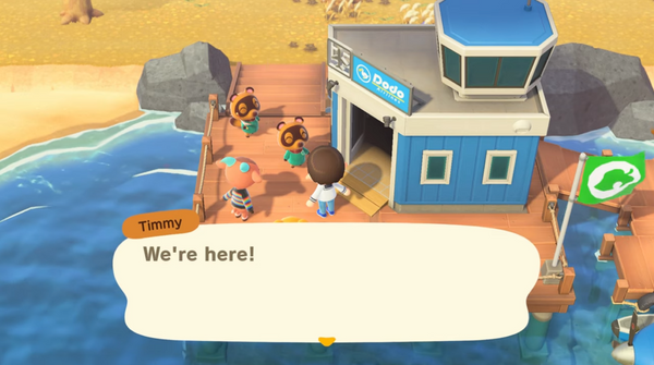
Animal Crossing is a chill and cozy game. People are not looking for a competitive or super challenging experience, the UX and UI should reflect that. Here's a typical player journey for the game. Gameplay Cache's playthrough was used for these images


Players hear and see two NPCs that explain who they are
Players go through the dialogue choices

Opportunity: Show players can skip the text with a UI addition
Players think it's cute and relaxing. They start to feel immersed

Players see a user name input field and are warned they can't change it
Players input their name and click confirm
Opportunity: Explain why the player can't change their name
Players know the name is public, but confused why they can't change it later
Players can pick male or female, limited skin colors, and can change it later.
Players customize their character and click confirm
Opportunity: Increase the number of customization options
Players think it's straight forward, but some might be left out by the limited choices

Players follow the NPCs to attend the orientation
Opportunity: N/A
Players are happy to start playing, and think about the exciting activities they can do
Players see a plane landing, hear nature sounds, and are told to go to an orientation
Paper Prototypes
[Welcome Screen]
Timmy & Tommy are welcoming players
[Username Screen]
Players can create in-game name that is not editable later
[Birthday Screen]
Players can create a birthday that is not editable later
[Avatar Screen]
Players can create their in-game avatar
[Island Screen]
Players can choose their initial in-game setup and island

[Cutscene Screen]
Players see a preview of the game, learn characters and what activities they can do
[Gameplay Screen]
Players know they are in the game, start playing, and go towards the orientation
Next, I laid out the screens and what each player can do on each screen (the paper prototype)
Flow Chart
Now that all the screens are determined, here is a user flow for the basic onboarding of Animal Crossing

Starting the Design
Wireframes
The wireframes were designed based on the current structure of the game. The wireframes were then refined based on usability testing. Everything in the wireframes was made from scratch except the game art which belongs to Nintendo.


Usability Testing
The research objectives of the usability test were:
![[Faraz Forghani]. UX_UI for Gaming. Class 1-13 (18).png](https://static.wixstatic.com/media/730f7d_c7735c70ab7247fbbfabc9961a74aff2~mv2.png/v1/fill/w_240,h_137,al_c,q_85,usm_0.66_1.00_0.01,enc_avif,quality_auto/730f7d_c7735c70ab7247fbbfabc9961a74aff2~mv2.png)
Evaluate the usability of each screen (main menu, gameplay, inventory, and username)
Evaluate the icons and two small opportunity additions to the Animal Crossing UI
Ask the players for improvement suggestions that benefit the game's usability
Iterate design based on the feedback given by players
-
Participants: Two female participants (between ages 29-35)
-
Background: Have played a good amount of Animal Crossing
-
Platform: Figma static wireframes (moderated)

The image makes right side feel empty
Would be nice to show in-game date

Players understood the intent of the chevrons

Information that tells you how to rearrange your inventory
Would love an auto-sort feature

It feels more inclusive when you can change your name, I don't think learning the intent will change how I feel towards it.
I don't like that I can't change my name. If they gave good reason, I would understand.
Post-Usability Wireframes
Two of the four wireframes were iterated based on the feedback from the usability test

BEFORE

AFTER
-
Changed the image to one that is more representative of the in-game menu
-
Added an in-game date to the main menu with the player's profile to remind the player

BEFORE


AFTER
-
Added a sort button on the bottom right of the inventory screen using a common sort icon
-
When that button is clicked, it opens a menu choosing between "count, name, type" and it'll sort accordingly


Refining the Design
Mockups
The following mockups were created based on the wireframes that were tested. The game images belong to Nintendo, but everything else is created from scratch based on Animal Crossing


Accessibility
These mockup screens were checked in all eight filters of the color blindness simulator (Coblis) and adjusted to make certain features stand out. The date and time were made darker for greater contrast


BEFORE
AFTER
In the red-blind dichromatic view, the tent was hard to spot on the map. So I provided a lighter shade of red to provide more contrast in the final result
BEFORE
AFTER
In the monochromatic view, the confirm button's background was a little too close to the background color so I made it a bit darker to showcase the button a bit better

