
Project Overview
The Product
A responsible website for a grocery brand called Moe’s which lets you find the in-store location of products and place pickup orders
The Project Duration
A few weeks
The Problem
Save time and avoid the frustration of searching for grocery items in-store
The Goal
Build a realistic responsive website that lets people search for the location of a given item and place pickup orders so they can have the items brought to them instead

Understanding the User
The user research part of this project is the same as the first portfolio project as the user it targets is the same so you can skip this section if you have already read it for the first project
Summary of User Research
The users generally have a busy and demanding schedule. A product that minimizes their time and frustration in-store would benefit them. Some also want to avoid talking to staff due to their introverted personalities
1
Pain Point
Busy and demanding schedule leading to frustration when the user can't find an item of interest
2
Pain Point
Not being able to interpret English well when people speak too fast
3
Pain Point
Introverted personality makes it harder to reach out to a staff for assitance
4
Pain Point
Lack of accessibility for users with special needs
Personas
Two personas were created based on the user prompts given in the google UX certificate class. These users were Leah and Joseph. First persona I created was Leah Johnson
Problem statement: Leah Johnson is a full-time doctor with limited time and a visual impairment who needs an app that can locate grocery products with screen reader technologies because it is a lot more convenient and time-efficient
Goals:
-
Spend time outside of work for my hobbies and personal life
-
Easy and efficient way to order groceries
-
The app to be accessible
Frustrations:
-
Not all apps and websites are optimized for screen reader usage
-
Busy and demanding schedule
Leah is a doctor from Rhode Island and works flexible shifts at a hospital. She has a visual impairment which makes her rely on screen reading technologies. Due to her busy schedule, she greatly appreciates time and values apps that are easy and efficient for ordering groceries
Second persona I created was Joseph Adebayo
Problem statement: Joseph Adebayo is a recent immigrant and college student with other responsibilities who would benefit from a grocery website because he has an easier time understanding English in written format
Goals:
-
Easer time understanding English at shops
-
More shops to have apps/websites as written format is more easily understood
Frustrations:
-
Not understanding English when people talk too fast
-
Not enough time for fun outside of studying
Joseph is an immigrant from Kenya. He's taking online college classes and English classes at night. He finds it difficult to understand the English of shopkeepers when they're speaking quickly and could benefit from an app while he's searching for products at the grocery store
As seen, these users have to juggle multiple responsibilities and they would like to spend their free time with their hobbies. Therefore, they would like to minimize their time at the grocery store and being able to locate items quickly and efficiently would help. This implies not having to look around for staff members or wandering around the grocery store aimlessly to look for the product. I then used these personas to come up with their user journeys
User Journey
The user journey begins when the user cannot find a product that they're looking for in-store. The goal of this journey is to locate products in store
The user journey involved the following actions and tasks:
-
Access the grocery store website/app
-
Find the app
-
Open the app
-
Bring up the home screen
-
-
Search for the item you need help locating
-
Find the search field
-
Type in the item
-
Find the item in the search results page
-
-
Navigate to the location in the item description page in the app
-
Click on the item
-
The item shows information about its location (aisle #)
-
-
Find item
-
Use grocery store signs to find item
-
Enter the right aisle
-
Find the shelf location
-
-
Add item to trolley/basket
-
Locate the item on the shelf
-
Pick up the item
-
Add to trolley/cart
-
There are some improvement opportunities such as coming up with an app branding that matches the look and feel of the grocery store. Having legible font-sizes and high contrast for better readability would benefit users such as Leah who have a visual impairment. Categorizing items with pictures would help people such as Joseph who might not be familiar with names of items due to English not being their first language
A search bar would benefit all users as they can go straight to the item of their choice. Our design should focus on and address time-efficiency and accessibility. Avoiding complicated language, using universal symbols and clear pictures with labels will ensure accessibility while also helping out all users. A survey should be asked during the usability test to see how we can further improve the user experience for all users
As a conclusion, both users start out the journey being confused, intimidated, and concerned because they're frustrated looking for the item and whether the store has it available or not. However, once they go through the search results and see their item is in stock, they are happy and relieved

Basic Information:
-
Age: 42
-
Education: Doctor of Medicine
-
Hometown: Rhode Island
-
Family: Single, lives alone
-
Occupation: Doctor

Basic Information:
-
Age: 20
-
Education: College Student
-
Hometown: Nairobi, Kenya
-
Family: Lives with family
-
Occupation: Full time student
User Journey
Starting the Design
Moe's Sitemap
This shows the overall sitemap for the Moe’s responsive website. Only the screens involving the main user flow will be designed for the purpose of this case study. The sitemap chosen for Moe's was hierarchical as it's a good fit for a grocery website

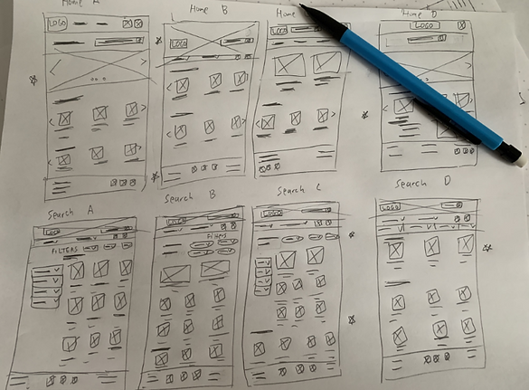
Paper Wireframes
Since we know the sitemap of our website already, we can come up with ideas for what each different screen will look like. Different layouts were brainstormed then favorites of each wireframe were selected (notated by star). The favorites of each page were merged to come up with one final wireframe
Digital Wireframes
The digital wireframe for the home page was designed first which is the most important page of the website as it serves as the hub for the website. Some of the design decisions are explained in the image below

Low-Fidelity Prototype
The user flow is pretty smooth and intuitive. The user goes to search for their item via the search bar or through a category and ends up in the search results page. They can then click on the item that they're looking for and find out its location. To test the low-fidelity prototype, you'll be taken to Figma where you can test the usability: low-fidelity prototype
Paper Wireframes (Screen Size Variation)
The paper wireframes were designed for two other screen sizes including mobile and tablet size. This allows for a responsive design. The left image shows tablet size and right image shows mobile size

Digital Wireframes (Screen Size Variation)
The search bar was kept at the top for efficiency, and the website design was used to make these other sizes. A hamburger menu was created to help prevent a crowded top navigation bar and a more effective design


Video description: The video displays a low-fidelity prototype of the Moe's responsive website starting on the homepage showing the Moe's placeholder logo on the top left. The top right has a search bar where the user can search for the item that they're shopping for. Underneath this section is the top navigation bar which includes a categories dropdown (bakery, beverage, dairy, fruits, meat, vegetables), discover dropdown (deals, new & popular), cart, and account icons. Similar to the app, the user can view a list of recent deals, search by category and see the popular items, but also view the featured item. On the bottom navigation menu, the user can click on multiple options such as "FAQ", "Store Locator", "About Us", "Support", "Terms & Conditions", and "Privacy Policy". The user clicks one of the images in the search by category section and then clicking on another sub-category to go to the search results page. Over here, the user clicks on one of the placeholder images, and goes to the item description page. The user can view some information here including the rating, price, description, location, and in-store availability. The user adds some apples to the cart and goes to complete the checkout process. The user ends the app journey on the order confirmation page which tells the user that their order is complete and ready for pickup therefore saving the user time and frustration of looking for it in the grocery store
Usability Study
I then conducted a moderated usability study instead of unmoderated so follow-up questions can be asked
The parameters of the study were:
-
Study type: Moderated usability study
-
Location: Canada, remote
-
Participants: 4 participants
-
Length: 15-20 minutes
The results of the usability study are shown below:
Usability study findings (high-fidelity prototype)
-
Add an option to change location before the checkout section for in-store availability checking
-
Users want the availability to edit/cancel the order before a certain time
-
An additional way of adding items to cart through the search results page
These findings are aligned with the research goal as they help the user save time and frustration at the grocery store
Refining the Design
Mockups
Letting the user choose the location before the checkout process is vital to the use of the website as every grocery store will have a different layout and thus a different location for items. I added “location” in the top navigation bar shown by the red arrow in the image to the right


Previously, there was no way to edit/cancel the order so they would have had to go to the store to resolve this. With the addition of this button, they can edit or cancel their order with just a few clicks


Category Page

Cart

Item Description

Account Page

Mockups: Home Screen Size Variations


High-Fidelity Prototype
Users thought that the flow was straight forward with no clutter and said they would use the app if they were a customer of Moe's. To test the high-fidelity prototype, you'll be taken to Figma where you can test the usability:

Video description: The video displays a high-fidelity prototype of the Moe's responsive website starting on the homepage showing the Moe's logo on the top left. The top right has a search bar where the user can search for the item that they're shopping for. Underneath this section is the top navigation bar which includes a home icon, categories dropdown (bakery, beverage, dairy, fruits, meat, vegetables), discover dropdown (deals, new & popular), cart, and account icons. When you hover over the texts, they become bolder to notify the user that it's clickable. However, only the main user journey was designed for the purpose of this project. Just like the low-fidelity prototype, the user can view a list of recent deals, search by category and see the popular items, but also view the featured item. These sections have clean images which give it the realistic look that I was trying to go for. On the bottom navigation menu, the user can click on multiple options such as "FAQ", "Store Locator", "About Us", "Support", "Terms & Conditions", and "Privacy Policy". The video shows the user journey by clicking on the search bar and getting taken immediately to the search results page. The search results page has a "sort by" filter and they can also filter by deals, prices, and types. It shows the relevant special deals at the top and then other results below that. If the user is logged in, they also have the option to favorite an item by clicking on the heart icon at the top left of each item. Another useful feature is they can immediately add the item from the cart. Now, the user clicks on the red delicious apple and goes to the item description page. The item description page includes the rating, description, location, in-store availability and also the nutrition facts of the item. When the user adds an item to cart, they receive a notification that the item was added to cart so they know that their action was completed. The user then goes to the cart to complete the checkout process. The cart has the remove item and revert option that the app had (users loved this feature). Once the user is satisfied with everything in their cart, they click "checkout" and get taken to the pickup details page. This page has a list of dropdowns for selecting location, date and time, and a section where the user fills out the personal information. The next screen is a standard payment information screen and user clicks on order summary to continue in their user journey. Here, the user can double check all the information they've entered and edit any mistakes. If the user is ready, they click place order and ends their site journey on the order confirmation page which tells the user that their order is complete and ready for pickup therefore saving the user time and frustration of looking for it in the grocery store. The user also has the capability to edit/cancel their order here
Accessibility Considerations
Accessibility features are an important part of the design because it helps everyone benefit from the product, not just the group it is being designed for. For example, a universal icon with labels might help a screen reader pick up the text for the icon, but also might help another user differentiate what the icon is if they're having trouble understanding it. The accesibility considerations we had for this design are the following
Designed with headings for each section so the user knows which screen they're on
1
Use of great color and contrast (mostly black and white) to ensure readability
2
Usage of universal icons with labels so they can be more easily understood
3
Going Forward
Takeaways
Users strongly agreed:
• Website is easy to use (4/4 users)
• I will use the website in the future if I were a Moe's customer (3/4 users)
• I got what I wanted from the website very quickly (4/4 users)
• This website saves me time and frustration at the grocery store (2/4 users)
Users agreed:
• I will use the website in the future if I were a Moe's customer (1/4 users)
• This website saves me time and frustration at the grocery store (2/4 users)
Next Steps
1. In a job situation, we would be handing off our designs and sticker sheets to backend engineers for the coding portion so it would be cool to see how to interact with back-end developers to ensure a good final product
2. Be more mindful of accessibility considerations, use a plugin such as contrast to see if colors and contrast complies with accessibility standards
3. Work on existing shortcomings to make them better and develop in areas that I have little experience in
4. Keep the user's need front and center in all designs
Impact
"It's quite clean. There's not a lot of clutter which is extremely helpful. All of these things you know is the usual. I do like the remove/revert feature (in the cart)"
What I learned
I understood the idea of component instances better when figuring out a method on how to directly add items to the cart from the search page